
2007-01-23 Illustration Friday -- Super Hero (anagram) O Her Purse, originally uploaded by royblumenthal.
I reallly really reallllly didn't want to do a Super Hero for this week's Illustration Friday topic: 'Super Hero'.
My solution came pretty quickly. I decided to do a manual anagram of the letters, and the one that satisfied me intellectually was this one: 'O! Her purse!'
The next challenge was working out how to illustrate that.
So I did what any self-respecting new-media-liberal does. I turned to the Creative Commons. Using the beta version of the Flickr Foto Finder, I looked for images that I may use commercially and that I may alter. ('Commercially', cos I'm now offering art prints of my paintings for sale -- email me if you're keen, and 'alter', cos I mostly take liberties with the works I use as inspiration.)
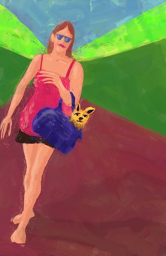
And that's how I came up with a pretty funny photo of a woman with a little dog in her purse. It's by a gal with a pretty funny profile. Her name is 'Malingering' (aka Irreverent). The photo is titled: 'at least it's not a pink pup purse' .
For me, the presence of the dog is what made this pic such a 'YESSSSSS!' for me. It kinda links in to the super hero theme, cos it's about this little innocuous animal who THINKS he's a super hero. And his leggie babe owner probably regards him in the same light.
I opted to use a completely different style to my normal mode.
In this one, I did very loose line drawings as the top layer, then immediately set them to a low opacity, so that I could start blocking in colour without paying too much attention to the line. I decided before starting that this one would have no line art in the final.
I then started working from background through to foreground, making everything pretty messy and shoddy and inaccurate. I used only the roller tool and eraser for this entire picture.
Each colour got a new layer. And each colour was sliced back with the eraser set to the thinnest possible width. Kind of like a needle scraping away at a piece of scraperboard.
I ended up with about twenty or thirty layers, which I only merged down when I was happy with my look.
The little messy bits of erasings are left in on purpose. I wanted this pic to show my process, to have evidence of being worked. And more than that, to give it the sense that it actually WAS handmade. I kinda WANT people to know that this isn't some sort of computerised conversion of a photo into an artwork thing. It's actually my eye, my judgement, my brushstrokes.
I changed the composition to suit my needs. And I've used the background to lead us directly to the woman's face. I wanted this because her face is in a dominant position at the confluence of a horizontal fifth, and a vertical third.
But the real hero of the piece is the crazy super hero dog in the purse. Which is why he's a straight drop down the woman's arm, down in the middle of the pic. This is NOT a great place for him to be in traditional composition. Which is why I strengthened the lines leading to the woman's face.
Im not sure if I'm making sense here. What I'm TRYING to say is that the compositional WEAKNESS of the dog's placement BECOMES the punchline, thanks to the strength of the woman's face in conjunction with the title of the piece. (That's also why the skirt and purse are so much darker than anything else on the page. To make sure that dog can't be missed.)
As usual, I painted this in a coffee shop (this time, my usual local haunt, the Mugg & Bean in Cresta), on my Toshiba Tecra M4 tablet pc, using ArtRage 2.2. A gorgeous lass I've dated a few times asked me whether or not I get paid to mention the hardware and software I drive. The answer is no. I do not receive ANY remuneration, or favours, or anything else from Toshiba or Ambient Design. I'm a paying customer. And I just love the products. And I'm keen to let people into my process. So I disclose stuff. Thanks for asking, Sandi!


No comments:
Post a Comment
Thanks for your comment!