|
| Figure 1: Han Hoogerbrugge's "Modern Living/Neurotica" series can be found at http://ml.hoogerbrugge.com. |
INTERFACE AS ARTIFICE
The Manipulation of Opaqueness and Transparency of Interface in Han Hoogerbrugge's 'Modern Living/Neurotica' Series
by Roy Blumenthal (Student Number: 8608887T)
WSOA7007: Critical Debates in Digital Arts and Culture
Wits School of the Arts, University of the Witwatersrand, South Africa
3470 words
Abstract
Han Hoogerbrugge's series of ninety-nine interactive Flash-animations in his web-based 'Modern Living/Neurotica' series are all self-portraits. They offer the viewer the opportunity to explore the interface.
The works lay bare the artifice that underlies the computer interface. This artifice, this constructedness, reveals the presence of boundaries. This ‘revealing’ allows the interacting viewer to glimpse the power of the boundary. When an interface attempts to be transparent, it seduces the viewer into a false sense of safety. In contrast, when the interface is apparent, the viewer is presented with choice.
This paper looks at how interface is revealed in some of the individual works in the series, and how these works further inform the full body of work. This analysis is situated largely in the arguments dealt with in Bolter and Gromala's WINDOWS AND MIRRORS.
Key Words
Hoogerbrugge, Interface, Boundary, Ideology, Flash, Digital, Art, Culture.
My Argument
When interface is shown to be artificial, created, an artifact, it becomes possible to apprehend the interfaces which surround us. These interfaces exist in all areas, and we're generally oblivious to them. When we are able to apprehend interface, we are able to become aware of how we may be manipulated by our own obliviousness. Ultimately, we're able to resist manipulation if we're aware of it. Hoogerbrugge's "Modern Living/Neurotica" series offers many experiential paradoxes and contradictions which bring the artifice of interface to light.
 |
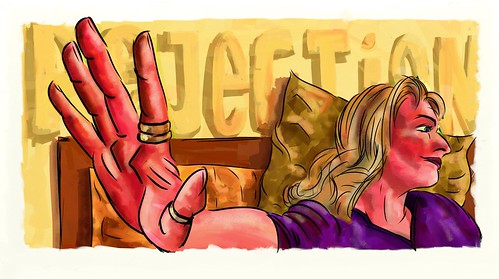
| Figure 2: A still from "Modern Living/Neurotica #60: 'New Religion'. |
Interface
An interface is, according to the Concise Oxford Dictionary, a 'surface forming [a] common boundary between two regions'. It's also a 'place, or piece of equipment, where interaction occurs between two systems, processes, etcetera'.
Hoogerbrugge's art places the viewer or user or interactor in an uncomfortable position. He makes us leap between regions as we interact with his work, figuring out its inner workings, and wondering what the content of the work means. We are at once on the surface, and inside the work. We are exploring how to interact, and we are interacting regardless.
 |
Figure 3: In Modern Living/Neurotica #96: 'Summer', Hoogerbrugge's avatar responds to your mouse movement by reaching up and tearing off the mask he's wearing. This reveals that beneath the mask is his own face. Which is yet another mask. Not to mention the buzzing of the flies.
Snippet online:
http://youtube.com/watch?v=PJpPMwKxrNk
|
Who is Han Hoogerbrugge?
Hoogerbrugge is a Dutch artist living and working in Rotterdam in the Netherlands ("Web Wizards: Digital Design Museum"). He started out as a paper-based cartoonist, and then in 1998 started making animated gifs of his work. Shortly after, he started using Flash to make the pieces interactive. And so the "Modern Living/Neurotica" series was born.
Hoogerbrugge explains the quirkiness of the self portraits: 'I wanted the character to make funny gestures and moves. If you loop those movements you’ve got neurotic behavior.' (Vlaanderen).
For him, the title "Neurotica" refers to the 'erotica of a neurotic person. The character in Neurotica is not a person suffering from an actual neurosis, but it’s more like… you know, when you’re bored and you’re just sitting around doing something and suddenly you wonder what the hell it is that you’re doing. It’s like lip syncing in front of the bathroom mirror. You only do that when no one else is around to see you. Or picking your nose. Private stuff.'
The fact that these are self portraits, and that the moments defined by the works within "Modern Living/Neurotica" universe are private, makes the viewer/interactor both a voyeur and a transgressor.
 |
Figure 4: In Modern Living/Neurotica #97: 'Rash', you start off with an avatar averting his gaze. Every now and again, the eyes make fleeting contact with the viewer/interactor. Then, when you put the mouse over the face, spikes tear out of the skin wherever the mouse 'touches', and the avatar stares unrelentingly at you.
Snippet online:
http://youtube.com/watch?v=ZG0ppSTBOVA
|
Penetrating Deeply
Hoogerbrugge's work could be referencing Walter Benjamin's idea that the production mechanisms in the making of a movie cause the movie-making equipment to have 'penetrated so deeply into reality'. (Benjamin 233). In Hoogerbrugge's work, he literally has the viewer/interactor slicing into his self portrait, his avatar. And it is this slicing that causes the artificiality of the interface to become apparent. For Benjamin, his movie-maker-as-surgeon 'greatly diminishes the distance between himself and the patient by penetrating into the patient's body'. (Benjamin 233). It's precisely the removal of distance in the Hoogerbrugge universe that paradoxically creates the distance necessary to perceive the artifice. More on paradox below.
There are important differences between the way a film and an interactive artwork such as Hoogerbrugge's penetrate into reality. In film, the viewer could be argued to be a passive receiver of the image. In the interactive work, the viewer/interactor takes action to embrace that penetration. In film, it's the machinery, the means of production of a film, that Benjamin sees as making the penetration possible. In Hoogerbrugge's work, it's the means of production as well as the interaction that wields the scalpel.
 |
Figure 5: In Modern Living/Neurotica #67: 'All Work', Han's Avatar is banging away at a computer keyboard. When a viewer rests their mouse on the Hoogerbrugge-lookalike, he stops typing, and looks imploringly at the viewer. When you click, the avatar leaps into the computer screen with a loud 'whoosh', onlyto emerge again from nowhere.
Snippet online:
http://youtube.com/watch?v=XT4kThgWt7g
|
Leaping Into Paradox
Hoogerbrugge is also being playful. He says, 'For me it's very important to seduce people to enter my work. The humor in my work has to do with that. It doesn't have to always make you laugh, but humor is a good starting point to make my work more approachable.' (Vlaanderen). The humour is one of the tools that he's using to manipulate the user into being taken in by the works.
It's the seduction present in Hoogerbrugge's universe that reveals how powerfully tempting it is for us to succumb to the lure of the transparent interface -- in his world and outside. This is because a good deal of the humour he uses relies on paradox.
When we make the man leap through the computer screen (in piece #65 "All Work") only to emerge again on our screen, we are taking part in an act that makes the interface apparent. Without the interface, we couldn't perform the action. It was only through our process of exploration and discovery that we found out what that interface was. Finding the interface has us causing this man to dive into a monitor as if it were an entrance into another world -- only to emerge from it (again and again, as long as we keep clicking) as if nothing has happened.
In their introduction to "Windows and Mirrors", Bolter and Gromala assert that ‘[d]igital art shows that the computer is not becoming invisible in our culture, as the electric motor did. We don’t want computers to disappear.’ (Bolter and Gromala 2). In Hoogerbrugge's art, the pervasiveness of the computer is highlighted. When we play with his interfaces, we are reminded just how mechanical our world has become. We are presented with the reality of computers, not as devices like electric motors, but as things that we can use. However, the underbelly of Hoogerbrugge's work is the seduction inherent therein. If we look past his interfaces, and instead find ourselves compulsively clicking on his pieces to repeat our transgressions against his effigy, aren't we being lulled into the trap of actually forgetting about interface?
At the same time, the paradox in the Hoogerbrugge universe also gives us access to the 'virtual', which 'cannot
but be felt, in its effects' [my emphasis]. (Massumi 133). Every time we encounter a seeming-contradiction in one of these scenes, we're traversing the boundary between the real world of us sitting at our own computer, and the virtual world of things happening inside the computer. In #65: 'All Work', the moment Hoogerbrugge's avatar enters the screen, we gasp. We
feel that avatar being sucked in. We share the trip into the bowels of the computer. And then he gets spat out the other end in some mysterious way, having to do with how those innards work. In Massumi's view, 'The appearance of the virtual is in the twists and folds of formed content, in the movement from one sample to another.' (Massumi 133). Right here, in these moments of absorption and re-embodiment of the avatar, we find our senses joining in to somehow find the merging between virtual and analog.
For me, this particular scene fuses these two notions: Bolter and Gromala's fear of the invisibility of computers and interfaces, and Massumi's assertion that the apprehension of the virtual is enabled by interface.
 |
Figure 6: In Modern Living/Neurotica #58: 'Target', Hoogerbrugge's avatar appears in the cross hairs of a rifle's telescopic sights. When the viewer/transgressor clicks, the avatar performs some form of gruesome self-mutilation, accompanied by the sound of what turns out to be a camera shutter. Compelling stuff.
Snippet online:
http://youtube.com/watch?v=T5pf8-LqnS4
|
Make the Hurting Stop
This brings us right back to Benjamin. For him, 'representation of reality by the film' (much like the reality presented in Hoogerbrugge's Flash-created milieu), 'is incomparably more significant than that of the painter, since it offers, precisely because of the thoroughgoing permeation of reality with mechanical equipment, an aspect of reality which is free of all equipment.' (Benjamin 234). Hoogerbrugge's mechanical wizardry thrusts us into the paradoxical role of surgeon, artist, voyeur, transgressor. All of these things serve two purposes. They dissolve the interface, and they also highlight its very existence.
Isn't Hoogerbrugge being cunning here? He's blurring the boundary between himself as artist and himself as subject. He's blurring the boundary between us as art-consumers and us as artisans. When he makes us hurt the self portrait he presents in a rifle site (in #58, "Target"), it's as if we're hurting the real him. But we know that we're not actually hurting anyone. Firstly, it's a representation of him. And secondly, there's no actual pain involved. But that doesn't stop us from flinching when our click causes his image to draw blood. And it doesn't stop us from giving it another click. And another. And another. We're hooked.
Each time we flinch for the pain we imagine the avatar to be experiencing, we're enacting the embodiment of Massumi's virtual. For him, what 'makes the virtual appear' is this very 'felt thought'. (Massumi 135). In confronting the viewer with the collision between the feelings of the avatar and the feelings of the viewer, Hoogerbrugge forces us to confront the intersection between the real and the imagined, the keyboard and the computing going on beneath the surface. He's making it impossible for the computer to disappear from sight and thought.
To my mind, Bolter and Gromala might have pushed their definition further. Hoogerbrugge's work demonstrates that one of the roles of digital art is precisely to
prevent the computer from becoming invisible, to
keep the interface opaque.
 |
Figure 7: In Modern Living/Neurotica #90: 'Black Hole Vertigo', when the interactor/user/viewer clicks on the upside-down man, he flips over. At the same time, the entire interface also flips over. This leaves the whole screen upside down, until you click on the dude again. You can navigate away from the piece to other pieces, and they stay upside down. Something is always upside-down, no matter what you do to rectify the situation.
Snippet online:
http://youtube.com/watch?v=2_c_ILjZWdk
|
Disorientation
When we explore the myriad short scenes presented in "Modern Living/Neurotica", we are disorientated by the melange of music, the number of different scenes, the stark simplicity of the artworks. While we may be focusing intently, our focus is actually fairly shallow. These scenes are shown small in the centre of our screens. They're surrounded by a sea of black. These are more reminders of the fact that we're looking at a screen, that we're interacting with an artifact.
We're almost certainly not on Hoogerbrugge's site with the lofty aim of appreciating and apprehending high art. We're surfing the web. We probably found Hoogerbrugge's site by accident, or because someone mentioned that it was 'cool'.
It doesn't really matter why we came to the site. It matters that the site isn't a formal gallery. It's not something that imposes the conventions of canon on the artwork we're experiencing. Quite simply stated, it's just another website. We could be at work. At home. Taking a break. Relaxing.
This puts Hoogerbrugge at odds with Benjamin:
Distraction and concentration form polar opposites which may be stated as follows: A man who concentrates before a work of art is absorbed by it. He enters into this work of art the way legend tells of the Chinese painter when he viewed his finished painting. In contrast, the distracted mass absorbs the work of art. (Benjamin 239).
He's at odds with Benjamin precisely because he's created the conditions for distracted concentration, for shallow focus. When we interact with/view Hoogerbrugge's work, we're absorbing the artifice, not the art itself. Our absorption is in our concentration on the minutiae of causing things to happen within the scene.
This puts Hoogerbrugge dead on target regarding Benjamin's notion of the functions of habit. Benjamin tells us that perception isn't just a matter of seeing. It's about doing too.
For the tasks which face the human apparatus of perception at the turning points of history cannot be solved by optical means, that is, by contemplation, alone. They are mastered gradually by habit, under the guidance of tactile appropriation. (Benjamin 240).
It's the doing by the viewer/user that sets Hoogerbrugge's work apart from being just a trivial amusement. When we get locked into the paradoxical juxtapositions inherent in the scenes, it's the very fact that we're doing, and ending-our-doing, through clicking, and stopping, that allow us to catch glimpses of what it means to have an apparent interface.
When we click, there is a moment where something happens. The first time it happens, it's unfamiliar to us. The second time, we're expecting it. But Hoogerbrugge's work often confounds expectations. Sometimes something else happens. So every gap in doing creates a moment of apprehension. This is apprehension in two important senses of the word: 'the faculty or act of apprehending, esp. intuitive understanding; perception on a direct and immediate level', and 'anticipation of adversity or misfortune; suspicion or fear of future trouble or evil'. (Dictionary.com). In the first instance, the viewer is intuiting the presence of meaning. In the second instance, the viewer feels the possibility of something unanticipated. Both of these apprehensions give rise to a moment of newness, of change.
This links very strongly to Brian Massumi's grappling with the virtual versus the analog. For him, doing is about allowing the body to be part of the sensing and creation of the virtual. As he puts it, 'The body, sensor of change, is a transducer of the virtual'. (Massumi 135). In Hoogerbrugge's work, there are echoes of the same contradictions that can be found in Massumi. If we want to embody the virtual, we need to search for it in the spaces between the interface and the interfaced.
 |
Figure 8: A collage of the menu bar. This shows the many options open to someone visiting the site.
|
Choices
The "Modern Living/Neurotica" series presents the viewer/user with a seeming ninety-nine tableaus. There are actually only ninety. And of those, a small number are animated gifs, and are therefore not interactive. Regardless of the actual number of scenes, the choice is actually almost overwhelming.
The pieces were created over a period of four years (from 1998 to 2001). And this can only have been both by design and of necessity. It takes a significant amount of time to create each Flash animation. Presumably, it would have been counterproductive to wait for all of the pieces to be finished before presenting them to the audience. What this means is that the early-viewers/engagers were treated to a broadening of the "Modern Living/Neurotica" universe over time.
As we travel up the scenes, we find a variety of themes emerging. Politics. Religion. Privacy. Cruelty. We find motifs being repeated, but with added twists. (For instance, the recurring image of the avatar's eyes making direct contact with the viewer's eyes. Sometimes it's a glare. Sometimes it's a plea.) We also find that Hoogerbrugge keeps us guessing. Some of his works require just a mouseover for something to happen. Some require a mouse click. Some require both. The entire 'Modern Living/Neurotica' world is a manifestation of Massumi's 'infolding and unfolding: self-referential transformation'. (Massumi 135).
 |
Figure 9: In Modern Living/Neurotica #63: 'Perfect Day', the Hoogerbrugge-avatar dances smoothly in the spotlight. Until you click on him. Then the music changes, and he turns into a skeleton doing the same smooth moves. Each time you click, the change happens, with a library of different looped tune-snippets backing the action.
Snippet online:
http://youtube.com/watch?v=aPfNBmhEhVI
|
Deadly Discomfort
The infoldings and unfoldings, the abundance of choice, and the intoxication of the disorientation we as viewer/users feel, place us in unfamiliar territory. We experience this world in a rather unsettled way. This experience is not a random side-effect.
For Bolter and Gromala, the importance of experience in digital art causes them to devote a section heading to the topic: 'To design a digital artifact is to design an experience.' (Bolter and Gromala 22).
Hoogerbrugge's world is intricately created. It's a semi-insane space, populated by one man (the Hoogerbrugge self-portrait persona) and his twisted fantasies and insights. The characterisation is consistent. The interactive strategies required for us to interface with it are varied, but congruent. It all adds up to a disturbing experience for the user/interfacer. It's certainly no comfort zone. So how does this measure up to one of Bolter and Gromala's criteria for great design?
Today, we do not operate computers; rather, we interact with them, and successful digital artifacts are designed to be experienced, not simply used. The term user is unfortunate (but now unavoidable), as if we were habituated or addicted to the artifact. Good digital designs do not addict; they invite us to participate, to act and react. (Bolter and Gromala 22).
One might say that Hoogerbrugge's world is certainly one of experience, not use. (After all, it doesn't really
have a use, in any functional sense of the word.) At the same time, it's possible to see the experience through Bolter and Gromala's use of the word 'addiction' through the entire series. The viewer obsessively clicks on elements of scenes, both to see if something will change, and to continue having the character behave the way it was behaving. Furthermore, the obsession extends beyond individual scenes. One finds oneself obsessively exploring other scenes.
So, even though there is an element of addiction in Hoogerbrugge's universe, the experience is certainly very powerfully designed in that it 'choreograph[s] the experience that the user will have.' (Bolter and Gromala 22). Hoogerbrugge cunningly keeps the scenes varied. He keeps the interactions unpredictable. He offers very strange content. All of this adds up to a user/viewer/interactor threading through the scenes Hoogerbrugge has presented.
 |
Figure 10: In Modern Living/Neurotica #77: 'Slipstream', the viewer/manipulator moves their mouse over Hoogerbrugge's avatar. This makes the shadow hand behind the avatar move in circles above the avatar's head. This in turn makes the avatar move his head around in a daze. A click, and the avatar slaps his own face with both hands, and both shadow and avatar appear to be in pain. Who's in control here? Are we, the viewer, controlling the controller? Or is the controller controlling us? Is Han Hoogerbrugge sitting behind his Wizard of Oz screen chuckling at our antics?
Snippet online:
http://youtube.com/watch?v=FpBIdj-vDUY
|
Who is in Control?
Hoogerbrugge's the master puppeteer in this work. He's pulling the strings, choreographing our experience, and making us think. So what's he getting us to think about?
He's offering us the opportunity to gaze behind the curtain, to see that if we are aware, we may notice who holds our strings. For Bolter and Gromala, being aware of the interface gives us some form of control over our own destiny. 'If we only look
through the interface, we cannot appreciate the ways in which the interface itself shapes our experience.' (Bolter and Gromala 9).
When an habituated Mac user attempts to operate a Windows machine, or a hardened Windows junkie tries to use a Mac, massive frustrations are apt to erupt. This has nothing to do with which operating system is better. It's more to do with which one is more transparent or opaque to a particular user. And the transparency is
not inherent. It's learned. Our own obliviousness to the fact that its learned gives the artifact power over us, the users.
Hoogerbrugge's work serves to remind us that control, like transparency, is not inherent in any system. When we look at the great big shadow finger spinning our Hoogerbrugge-hero around by the head (in #77, "Slipstream"), it becomes obvious that, once again, a paradox is at play. It is we who are manipulating the manipulator. It is our silhouette appearing behind the Hoogerbrugge-character. And it is Hoogerbrugge himself who is causing us to perform that manipulation. Our silhouette is also his shadow. So we merge with Hoogerbrugge's avatar. Which merges us with Hoogerbrugge. Which merges him with us. It is
his programming,
his artistry, that make this world of his work like this.
It is he who is spinning
our heads around.
All of this serves to remind us that in the world outside of Hoogerbrugge's "Modern Living/Neurotica" world, the many interfaces we accept as transparent are actually manipulated creations. The great television news channels like CNN and BBC appear to be neutral and objective. Hoogerbrugge's work suggests that no matter how neutral something may look, it's always an artifact, a creation, a choreography of user-experience.
In a world where interfaces are all around us, being aware of those interfaces allows us the ability to glimpse who is in control. Hoogerbrugge's "Modern Living/Neurotica" series shows us that control is a constantly shifting thing.
 |
Figure 11: In Modern Living/Neurotica #79: 'Faithful', the screen loads up with a white cross in view. When you slide your mouse over the cross, a maniacal Hoogerbrugge-avatar dances puppet-like beneath the holy symbol. His eyes look demonic. His hands curl lasciviously.
Snippet online:
http://youtube.com/watch?v=VcnP_xob2aE
|
The Outside Agent
Benjamin's shriek from the soul about humanity's lot sums up what happens when we remain oblivious to the powers exerted on us by our own unawareness: '[Mankind's] self-alienation has reached such a degree that it can experience its own destruction as an aesthetic pleasure of the first order.' (Benjamin 242). When we chuckle at the spectre of the manipulativeness of religion evident in #79, "Faithful", we're laughing partly at our own self-destruction, and partly at our awareness of that self-destruction.
Hoogerbrugge seems to be suggesting, like Benjamin, that we -- as humans -- seem to habitually place our fate in the hands of puppeteers. Also, like Benjamin, he's hinting that it's all to do with personal responsibility. If we don't take action against the outside agents who control us, we have only ourselves to blame.
Bolter and Gramola contend that '[f]or many digital artists, art is a critical technical practice, a means of critiquing the assumption that technology is a tool to be applied to all social problems'. (Bolter and Gromala 159). In light of this, it's easy to see Hoogerbrugge as using his technology to help the web-surfing world to notice some of the problems we're allowing to crop up. He's certainly using his art, 'both to pose cultural questions and to suggest solutions'. (Bolter and Gromala 158).
For me, the biggest solution I see in his work is for the viewer/user/experiencer/interactor to wake up to the opaqueness of the interface. No matter how transparent it seems, it is an artifact, and is the result of artifice.
Because of the overarching presence in Hoogerbrugge's work of paradox, I'll invoke Massumi again in closing: 'The challenge is to think (and act and sense and perceive) the co-operation of the digital and the analog'. (Massumi 143). While I haven't argued Hoogerbrugge's work as a bridge between analog and digital, I have argued it as a bridge between the transparent and the opaque. For me, Massumi's challenge is to find the centre of any dialectic, whether that dialectic is analog/digital, real/virtual, transparent/opaque, political/personal. And that's where Hoogerbrugge is a powerful artist. His stuff reveals the dialectic, and his works engage the viewer/interactor in glimpsing the dialectic.

Citations
"apprehension." Dictionary.com Unabridged (v 1.1). Random House, Inc. Page accessed 12 June 2007. <Dictionary.com http://dictionary.reference.com/browse/apprehension>.
Benjamin, Walter. Illuminations. New York: Schocken Books, 1968.
Bolter, Jay David, and Diane Gromala. Windows and Mirrors: Interaction Design, Digital Art, and the Myth of Transparency. 1st ed. Cambridge, Mass: Massachusetts Institute of Technology, 2003.
Hoogerbrugge, Han. "Modern Living/Neurotica". 1998--2001. Hoogerbrugge.com. Page accessed 4 June 2007. <http://ml.hoogerbrugge.com/>.
"interface." The Concise Oxford Dictionary. 7th ed. Oxford: Oxford University Press, 1989.
Massumi, Brian. "On the Superiority of the Analog",
Parables for the Virtual: Movement, Affect, Sensation. Durham: Duke University Press, 2002.
"Web Wizards: Digital Design Museum." Han Hoogerbrugge. Design Museum, London. Page accessed 5 June 2007. <http://www.designmuseum.org/digital/web-wizards/han-hoogerbrugge>.
Vlaanderen, Remco. "Interview -- Han Hoogerbrugge." 16 August 2006. SubmarineChannel. Page accessed 4 June 2007. <http://www.submarinechannel.com/interviews/index.jsp?id=20983>.


 I've screengrabbed this with 'Show Details' on. Notice the 'Mailed-By' field. It's 'ifk.wopsa8.com'. You can easily see that that's nothing to do with Absa if you delve into the innards of the message.