This is another resource for teachers and trainers to make use of.
It's a pretty simple concept. And Jennifer has implemented it in her classroom. And it's working a storm with fourth grade kids.
Here's how it works...
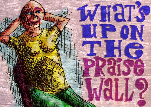
The 'Praise Wall' is a pin board on the wall, with a header such as this painting. The class members are invited to get up at any time they like to write a note of positive praise for a fellow class member.
That's it.
Very easy. Very simple. Very elegant in the way the positivity becomes something addictive.
We're going to be observing whether or not the kids abuse the system. But so far it seems to be flourishing. And it's flourishing pretty much with the kids policing themselves.
I'm thrilled that the idea has taken off. And I hope it can live on in other classrooms. Maybe it's one tiny way that peace in this world might be promoted.
I made this painting in several stages. Firstly, it's based on a sketch from one of my Moleskine notebooks. Secondly, I messed around with the pic in Photoshop CS2, getting the layout right. Thirdly, I painted the lettering and colouring in ArtRage 2.5. Lastly, I did the texturing and finishing back in Photoshop.
Tuesday, October 23, 2007
What's up on the 'Praise Wall'?
What am I proud of today -- classroom poster
Jennifer, my girlfriend, teaches fourth graders. Lately, we've been chatting about how to enrich the learning experiences of the kids.
I'm in the habit of asking myself three questions every night before I go to sleep. I ask, 'What did I learn today? What did I contribute today? What did I enjoy today?'
I told Jennifer about the questions, and she thought it would be a good idea to start the school day off with a little one-minute meditation on a particular question.
So I'm making five posters for her to use. One for each day of the week. There'll be the three questions I ask myself. This one: 'What am I proud of today?' And a fifth one: 'How have I touched someone's life today?'
She'll be choosing three kids at random to share their answers with the rest of the class if they choose.
You're free to use any of these as resources in your own classroom or training situation. Please go ahead.
The resolution of this pic means it's cool to print it to around A2 with no hassles. It might even be fine up to A1. Enjoy!
And please let me know if you get any super results from this.
I made this painting in several stages. Firstly, it's based on a sketch from one of my Moleskine notebooks. Secondly, I messed around with the pic in Photoshop CS2, getting the layout right. Thirdly, I painted the lettering and colouring in ArtRage 2.5. Lastly, I did the texturing and finishing back in Photoshop.
Wednesday, October 10, 2007
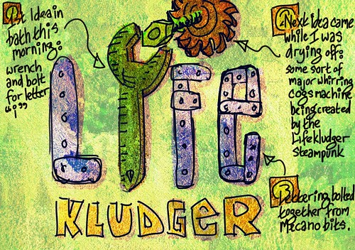
Lifekludger first idea
I'm busy designing a logo for Dave 'Lifekludger' Wallace. He mooted the idea during a podcast interview he did with me some time ago. (The Extraordinary Everyday Lives Show #029 - Roy Blumenthal)
I'm basically open sourcing my thinking, and inviting the internet community to offer me their thoughts.
This is my very first grappling with the concept.
Dave's brief is fairly simple. He wants the Lifekludger logo to evoke the idea that things can be converted from their original purpose to make the lives of dis- or differently-abled people easier.
One of his missions in the world is to generate change in the way things and environments are designed. He's a quadriplegic in Australia. And to him, access equals community. Denial of access equals enforced isolation. When an architect or designer makes something that is fundamentally unnavigable by a disabled person, that architect or designer is actively isolating the disabled person.
I'll get deeper into his brief in another post. And I'll also talk a bit about my thinking.
In the meantime, this is the first idea. And as all designers and inventors and writers know, the first right idea is not necessarily the one to go with. It's important to generate many ideas. Some have to be crap. Some will shine. But it's essential not to be too critical (positive OR negative). Cos that stems the idea flow.
This sketch was scamped up in ArtRage 2.5 on my Toshiba Tecra M4 tablet pc after a long bath.
Tuesday, October 09, 2007
2007-10-08 Rule No 1 for Freelancers -- Get the Purchase Order First
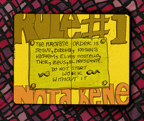
2007-10-08 Rule No 1 for Freelancers -- Get the Purchase Order First, originally uploaded by royblumenthal.
Here's a golden rule for freelancers...
If you're going to do work for a corporate client, simply do not put your butt in your car seat UNTIL you have a purchase order number. In the corporate world, a purchase order is as good as money in the bank.
In a recent gig I did, the client was a consultant who hired me to do work for his client. When I told him I need payment up front, he uhmmed and ahhed. Said that it was very short notice, and his client wouldn't be able to get me on the system quickly enough.
So I said, 'Okay, just this once. But I'll have my payment before month-end.'
'No problem whatsoever,' he lied.
I did the gig. And he simply stopped communicating with me. And it took some heavy action on my part to actually get payment out of him.
In the end, he's got a lot of egg on his face with his corporate client. And he might still find that he's going to have to do quite a lot of explaining to them about how shoddily he treated me.
But the lesson is this... get a purchase order number. Put it on your invoice. Invoice BEFORE the gig. And only then get your ass to the gig.
This pic started off in my Moleskine as pen on paper. It then got converted into digits via my HP Deskjet F380 scanner/printer/copier. And then my Toshiba Tecra M4 tablet pc and Photoshop CS2 took over in the colouring department, with me wielding the stylus.
Monday, October 08, 2007
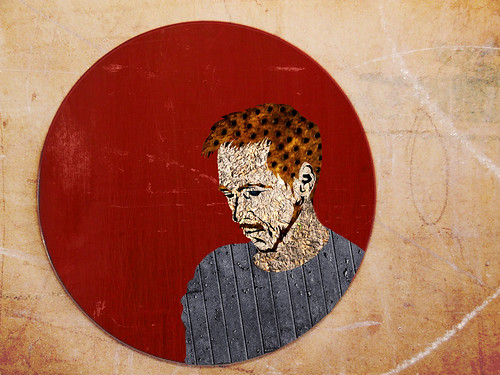
Damon Berry of the Rising Sun -- Collage2
Damon Berry's a great buddy of mine. He's just finishing the tweaking of some of his poetry/song recordings, and he's going to release the album online.
Yesterday he gave me a call and said, 'Hey! There's an awesome art exhibition on at the Joburg Art Gallery! Wanna pull in?'
So Jennifer and I went along with him. And we took Jennifer's camera. And mucked around taking strange pics of each other in the gallery.
Because we weren't allowed to use flash, the pics were pretty fuzzy and out of focus. But they were pretty cool. And I decided I'd try and play with an unusual (for me) technique in Photoshop to get them looking groovy.
So here's one of them. It's for Damon's album cover art (if he wants it).
The way I made the two collages in this series was quite simple. I used the photo as reference. Then I used the lasso selection tool to hand draw paths, which I then inverted, and simply deleted unwanted bits of various found textures. Once I'd done the basic building of the image, I used various layer blending to mess with the colours and contrasts. Voila.
Thursday, October 04, 2007
2007-10-03 Satisfaction in the Stadium -- mid res
David Bowie, Eric Clapton, David Gilmour, and Mick Jagger. All gathered in a happy, fantasy bonhomie.
This is a commission for Eduardo in Brazil. He's a dude who digs my work, and wanted me to do something special for his new apartment. He had a dream featuring these four characters.
So here's my interpretation of it.
I thought I'd nudge the recognition factor a little by punning on their names. I mean, how else is someone supposed to know that that's Bowie?
While I was painting this, it struck me that Bowie looks a heck of a lot like Robert Redford. And Clapton kinda looks a bit like Curt Cobain. But maybe that's just how my head works.
I prepped the references for this painting in Photoshop CS2, comping various things together to get the right composition. Then I worked all of the painting in ArtRage 2.5, and did all of my tweaking in Photoshop CS2.
Wednesday, October 03, 2007
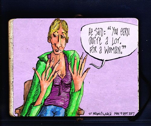
2007-09-09 A Monday Night at AACA -- You Earn Quite a Lot
I scribbled the Moleskine base for this image a month ago at an Al Anon Adult Children of Alcoholics (AACA) meeting.
One of the women who shared told us about a male boss of hers who told her, 'You earn quite a lot... for a woman.'
That was in response to her asking for a raise.
I've actually been taking a break from AACA for the past month. I've been finding that the twelve steps not only don't work for me, but that they actively work against me.
I've been going for somewhere close to a year. And getting to know quite a lot of the personalities there. And my observation is that most people there are in a holding pattern. They're stuck in the misery of their current lives through a focus on the misery of their past hardships.
I don't see a hell of a lot of evidence of progress or growth. I don't see a hell of a lot of evidence that people are in therapy, that they're taking control of their own destinies. I see micro insights which seem to be snuffed out by the next session.
Naturally, these are my own observations, biased by my own particular worldview. I believe in the power of therapy, for instance. I don't believe in religion as an ordering force in my life.
At the same time, while I'm certain AACA is EXTREMELY valuable to many people, as it was for me at the beginning, I need to surround myself with growing people. Not people who seem to me to be holding themselves back. Cos I don't want to be held back by myself.
One of the things that typifies an adult child of abuse is that we tend to collude with other people's 'needs'. So, if a room of people 'needs' one to appear to be failing, an adult child of abuse tends to fulfill that need. Either by acting as if they are failing. Or by sabotaging themselves so that they ACTUALLY fail.
And while I'm certain that AACA people all WANT each other to succeed and flourish, there's an undercurrent created by the steps themselves that says, 'Thou shalt not succeed. It's not in the council approved literature.'
So I'm deeply ambivalent about it.
But I like the doodles.
This painting originated as a pen on paper sketch in my Moleskine. I scanned it, then coloured it in ArtRage 2.5 on my Toshiba Tecra M4 tablet pc.
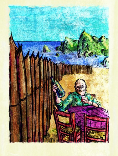
2007-10-03 Geoff Mulling Over His Birthday Wine
A friend of mine's boyfriend's father is turning 70 soon. So he zapped me on Facebook and said, 'Roy... how much would you charge to make a portrait of him in your own inimitable style?'
So we negotiated. A deal was struck. Money was put into my bank account.
And yesterday I used the reference pics he supplied to create this elaborate scene.
The reference pics were tight head and shoulder shots. Which I felt were a little bit bald. Not bald as in 'lack of hair'. Bald as in 'not really revealing much about the dude'.
Which is why I searched through my reference materials to find a decent setting. And I had Geoff engaging in one of his favourite activities... exploring the inside of a decent bottle of wine.
I sent it off to Jason, deeply confident that the second half of my payment would follow immediately, along with gushing praise. Sadly, it was not to be. (Actually, it's not that sad. It's an expected thing. In portraiture, the client almost always has something in mind. And when it doesn't match, the portraitist always expects to make changes.)
Jason said, 'Uh, uhm, uh, I don't know how to say this... but... it's not EXACTLY what we had in mind. We were really hoping for a tight head and shoulders shot. I'm so embarrassed'
'Hey,' I said, 'no need to feel embarrassed! It's a portrait. You're the client! I'll happily do another version.'
'Phshew,' said Jason. 'I really didn't know how to tell you that. Oh... by the way... can you make his head more round?'
Lessons to be learned...
1. Tell the client in advance that they're free to dislike the pic, and that changes will happily be made. This will avoid their feeling embarrassed.
2. When a client supplies multiple reference pics, and they're all tight head and shoulders shots, chances are they want a tight head and shoulders portrait, not a mystical scene on a beach.
So... this is the one that got away. The new version is sitting with Jason right now. I expect he's discussing it with his boyfriend. And I'll know what he feels about it soon enough.
In the meantime, this pic's out and about. Feel free to hate, like, love it.
This painting was made in ArtRage 2.5 and finished in Photoshop CS2. It started out in CorelDraw 10 as six reference photos all comped together to make a rough reference. The arm holding the wine bottle is actually from a pic I took of my own arm holding a bottle of balsamic vinegar.

